Free Range – Part 2

After a couple of weeks the relentless rounds of shows that make up Free Range can start to blur into one another. Something I always notice as I drift from room to room is how the work I like seems to cluster in groups around certain courses; is it the quality of the teaching ay those colleges or do the students drive each other on? I found one such seam of work running through show put on by the graduates from Rochester, UCA.

The intial highlight for me was Daniel Warnecke’s ‘Subject to Impression’. A row of small vitrines containing brightly coloured figurines; a red-bearded hipster, in skinny jeans and blue blazer, slightly sinister looking twins stand side-by-side in matching dresses and knee-high white socks, a guy wearing a parka tightly gripping the hood which is pulled up around his face. There was a strange softness to their features – like a hand coloured black and white print – I guessed they were 3D prints. They all seemed to exude a sense of cool, and attitude absent from pretty much anything else I’d seen, but they also seemed naggingly familiar. It was only later that I stumbled on the rest of his work, on the opposite side of the wall the figures had been laid out along. Large close-up photographic portraits taken from the figures – and of course, in a moment of forehead slapping obviousness I realised all the figurines had been taken from iconic portraits – both photographic and painted. I actually found this slightly disappointing – the characters went from being fantastically observed character studies to just people ripped from the pages of an art book. But the photographs themselves still worked really well, I was slightly obsessed by the texture of the plastic, almost like wood grain. A large, dark portrait of a man in a black roll neck – groan, Hemingway (horrific memories of having to read The Old Man and The Sea start rising up again) – the slickness of the surface looks almost like sweat.

So I found myself in two minds about the work – I loved the use of the 3D printing – the figures felt like bright, modern sculpture and the photographs accentuated the strange almost haunting fuzziness to their features, like blurry stills from a videotape. The photographs really explored these qualities, and this dialogue between three-and-two dimensional representation. But somehow the need to reference art history seemed a bit unnecessary, it felt like it was there for some sort of artistic justification – but really the world just doesn’t need yet another Magritte pastiche, and the visual pun of the granny smith sticker instead of an apple floating in front of the businessman’s face felt a real misstep.

Free Range – Part I

Free Range descends upon the old Trueman Brewery in East London each summer. It’s the showcase for the country’s art courses and over a period of several weeks showcases fine art, fashion, graphic design and photography.

As you’d expect from student work the quality varies wildly – both across individuals and courses – but its always an enjoyable way to spend an hour or so, drifting around the warren of rooms.

By far the strongest work on this first brief tour of the 2015 shows was by the University of Westminster. I’m not sure how the various spaces are allocated but they certainly merited what seemed the largest and brightest space in this old industrial building. My favourite piece was ‘Modern Living‘ by James Berrington – a series of prints of individual house bricks, all shot at the same angle under even light. I was fascinated by the variety of colours and textures or the bricks, and by how strangely edible they looked – like blocks of crumbly biscuit or slabs of soft fudge. However it was lunchtime and I had eaten yet, so perhaps that was colouring my judgement.

Of course, shooting typologies is nothing new – its been a familiar approach from Bernd and Hilla Becher onwards – and the internet is awash with subject-based collections of images ‘curated’ by anyone with access to a smart phone and an armoury of retro-filters – but I liked the stripped down style of these images. Taken individually they could be commercial stock photos – but en masse they looked almost pop-art. And I found myself wanting to know more about these bricks than I did about most of the more obviously worthy subjects on show.

Jasper Jones trod familiar territory – man’s impact on the environment, incongruous urban forms in vast arid landscapes – but presented them in a mixture of formats juxtaposed in a variety of interesting ways. Increasingly I find myself wanting to move beyond the single image, the overly respectful photo book which treats an image, however mediocre or hackneyed, with the reverence that only an excess of white space and a tastefully minimalist caption can truly capture. I want to see images juxtaposed and cropped and printed in different styles, placed upside down and printed across. I’m not sure Jones was entirely successful but I was glad to not be confronted by yet another row of tasteful black frames and white borders.

Not that tasteful is bad. A beautiful images is a beautiful image and I loved Sophie Fauchier‘s dreamy images of her father’s country house in Normandy – all soft focus and atmosphere – it felt like watching an art house movie with subtitles on a Sunday afternoon in winter (you know, that feeling). The best image, a pair of bright red wellington’s lying on the bank of a lake, all hazy Whistler blues – reminiscent of Nicholas Roeg’s ‘Don’t Look Now’.

Photo London / Self Publish Be Happy

Photo London was a slightly overwhelming experience, a vast display of photography from over seventy different commercial galleries presented in the impressive space of Somerset House.

Stepping into the tight warren or roofs and corridors, after the grand space of the central courtyard – the most impressive space in central London ? – I pulled out my notebook and started scribbling down notes in black-spider script.

Inevitably the images I saw earlier in the day had the biggest impact, the sheer number and range of photography on show packed into the warren on rooms and corridors began to have a numbing effect as the day wore on. What, yet another Margaret Cameron photo? So the following notes probably reflect my initial excitement than a truly objective list of the fair’s highlights.

So bearing this in mind, Thomas Zander was the lucky gallery to be the one I stumbled across first and got the full weight of my appreciation, un-dimmed by niggles about my aching feet or regrets about wearing quite such a warm jacket. Lewis Baltz ‘Sites of Technology’- large-scale photographs of sparse, sterile rooms filled with monolithic, featureless boxes housing unspecified technology – the antithesis of sci-fi tech with its fetish for complexity; flashing lights and and cat’s cradle cables – here whatever computing is going on is hidden behind clean lines and slightly incongruous pastel pinks and powder blues. In one shot [*], two cheap plastic electric desk-fans sit on the floor beside a row no-doubt highly expensive servers – a few dollars protecting how many thousands?

The accents betrayed the hot-beds of contemporary art photography scene – French, Japanese, American. Gallery people – all air kisses and West London wealth.

The whole experience was like the compilation albums, a greatest hits collection bringing together all the big names of photography past and present – Now That’s What I Call Photography 2015. But like those albums, after a while it all seemed a bit too much. I began to long for a display with a narrower range but more depth – room to explore a photographer or an idea, to follow something through to a conclusion. Album tracks rather than a succession of hit singles.

By the time I made it to the Mezzanine level photography fatigue was beginning to set in – and perhaps that explained why I found the quality on this level seem to dip considerably. There were still gems, Eva Stenram’s ‘Drape (Colour 1)’ [*] made me think of clumsy censorship but also John Stezaker’s surreal photo-collages. Another highlight was Noemie Goudal‘s large-scale images of natural phenomena sculpted out of man-made materials – a polystyrene waterfall, a waterfall formed from plastic sheeting. They look majestic, and obviously throw up questions about how man spoils his environment, but they also elevate the materials themselves.

With the fashion for large scale, hyper-detailed prints it would have been easy to miss Karl Martin Holzhauser‘s Mechanical Optische Unterschung 1975 – a grid of ghostly symbols [*], which despite being in black and white, looked strangely modern – although that may just be because they reminded me of the buttons on the Playstation controller.

Photo London
Somerset House
21st – 24th May 2015

Self Publish Be Happy – Project Space
Tate Modern

Supersymmetry – Ryoji Ikeda

Multi-storey car parks seem to be as integral a part of hip London life as overly precious coffee, craft beer, tattoos and extravagant facial hair. They’ve become cafes, cinemas and art galleries – no-one does anything as mundane as park a car in one anymore.

Ryoji Ikeda’s is a Japanese visual artist and composer of electronic music, and Supersymmetry represents his first major solo exhibition in the UK. The vast, dark space was divided into two rooms. The first contained a series of light boxes, on which tiny spheres, like ball bearings, move in shifting patterns as the surface gently tilts below them. It’s a simple but hypnotic display – moving between the organic – the elements seeming to take off in loose formation like the murmurations of starlings, then group and settle again. The sounds of them rolling across the surface is reminiscent of the tide washing onto a sandy beach. But then you notice as they settle, patches of geometry, brief glimpses of order – straight lines temporarily forming into fragile shapes then break apart again just as quickly.

I could have done without the strobe-lighting though – there’s something about those health-and-safety notices that always precede anything containing strobes that puts me on edge.

The second room consisted of two banks of monitors facing each other so they receded into the darkness, forming a corridor of light.

CERN seem to be on a mission to capture hearts and minds, or at least arts and minds. Author Will Self was recently invited to tour the complex for a radio 4 documentary, Self Orbits CERN – an unusual choice of writer if they intended to de-mystify their work for a wider audience as his writing is often as challenging as anything that comes out of the experimental physics community.

Ryoji Ikeda
Supersymmetry
Brewer Street Car Park
23rd April – 31st May

Thomas Struth – Marion Goodman Gallery – 2015

Standing upstairs in the large, white space of the Marion Goodman gallery, alone except for the tops of the heads of two gallery assistants poking above the minimalist stockade of their work area, it struck me that this could in fact be a new work by Struth, a study in absence, perhaps his first move into installation art.

This is Struth’s first major exhibition in London since his Whitechapel retrospective of 2011 and some of the themes are familiar. The exhibition is split between photographs of technology shot in California an images taken in Israel and Palestine as part of the ‘This Place’ project. Whilst there doesn’t seem to be much to link these two themes I actually enjoyed the contrasts between the two sets of work.

The Middle East photographs show vast, bleached landscapes largely devoid of human life but scared by their presence. ‘Al-Ram Quarry, Kafr’ Aqah, 2011′ shows an ancient landscape, the sides of the valley shaped by by erosion, rivulets etched into the rock like stretching fingers. This organic, natural shaping of the landscape is contrasted with straight cuts and precision of the neighbouring quarry. The scene is framed by the concrete buildings, that like much of the habituation in these works seems to be in a weird flux between new construction and decay.

These strange edgelands appear again in ‘Har Hama, East Jerusalem, 2009’. Here a row of new buildings is lined up along a ridge, like the cavalry of an ancient army waiting to charge onto the battlefield below. A carpet of pale-coloured aggregate creeps across the dark scrubland like a lava flow.

The most striking image from this group of images is “City Hall, Tel Aviv, 2011” – however the modernist building, shot square on and corrected for vertical perspective and printed on a grand scale like a vast abstract artwork, feels a little like a cliche however impressive the result. This could be an image by his fellow Dusseldorf School of Photography alumnus Andreas Gursky, or a thousand photographers on Flickr (myself included) mimicking the style.

Of the other theme of the collection, two images caught my attention.

“Polymer Head, JPL, Pasadena 2013” shows a dummy head wearing an outrageous blonde wig, with more than a touch of the Boris Johnson about it, stuck on a pole in the middle of a crowded desk in some undefined research department. It’s an amusingly surreal image, but my favourite image was less immediate; “Epitaxy, JPL, Pasadena, 2014” shows a complex piece of scientific machinery, its purpose obscure, but a cat’s-cradle of wire and cables emanate from it like tendrils, giving it an almost organic feel. It wouldn’t look out of place in a Hollywood sic-fi movie. It’s only once you have stood there a while wondering what strange, esoteric function it carries out that you notice, hidden away to the left, it is wired up to an old-fashioned monitor propped unceremoniously on an upturned plastic bucket. A red, rubber mallet rests on top.

Thomas Struth,
29 April – 6 June 2015,
Marian Goodman Gallery

Deutsche Börse Photography Prize 2015

Photography has arguably never been more popular. The combination of mobile phones with ever improving camera technology and the popularity of social media has created a vast army of amateur photographers constantly documenting the minutiae of everyday life in ever greater detail.

The Photographers’ Gallery‘s annual photography prize rolls around for another year.

Sometimes it feels like I know what I’m going to get before I even walk through the door – there’ll be some large, black and white portraits of people on the edge of society staring defiantly at the viewer, there’ll be conceptual piece put together with crudely created photographers and probably some text written on an old typewriter, then some large, hyper-detailed colour photographs of somewhere in the world showing mans effects on the environment in some suitably awe inspiring way.

This year’s selection has that same feel of boxes being ticked, and it doesn’t feel like the strongest of years, but it did throw up some surprises.

The exhibits were spread across the two upper floors.

Nikolai Bakharev’s black and white portraits of couples and families relaxing in the sunshine taken over ….. There was a refreshing honesty to the images – we’re so used to seeing perfect bodies, unblemished faces staring out from photographs every day in magazines and advertising, being confronted with real people’s bodies of all shapes and sizes in such relaxed and contented poses actually felt quite striking.

Zanele Muholi’s portraits highlighting the lives of lesbian and gay people in South Africa felt flat afterwards – I struggled to understand what the wall of similarly composed portraits was trying to say. The photographs felt too similar to numerous other series of images capturing groups or cultures I’d seen over the years.

By this point I felt slightly jaded – like the photographic equiveltn of an Elbow album, worthy but slightly dull, expertly crafted but also slightly routine.

The next floor though turned this upside down.

Mikhael Sobotzky and Patrick Waterhouse work centres around Ponte City, a tower block in Johannesburg built originally for high-end clients, only to slide into disrepair and become home instead to the fringes of society. The image that represents the collection on the cover of the Photographer’s Gallery catalogue is striking but familiar, a black and white shot of the tower’s interior shaft highlighting the awesome scale but also the grim neglect. I was primed for a series of large-scale architectural works contrasting grandeur and folly – but found instead something far more varied and interesting.

The centre-piece for me was a vertical wall of transparencies showing views from the tower’s windows laid out like an enormous contact strip, each row representing a floor of the building. This formal grid of images, itself broken down further by the frames of the windows, or blocked out by the melancholy haze of a new curtains. As your eye scans the work from ground level, literally around your feet, up towards the highest floors way above eye level, the scenes change. The highly detailed images are so small, that initially you take them in simply as colours or shapes. By the upper floors the cityscapes int eh photos themselves are becoming ever more hazy and indistinct.

There are two accompanying pieces, less successful but still interesting, looking inwards rather than out, focussed not the doorways to the apartments. Once again the initial response is to the structure, the shift in colours between floors, from blacks, blue, browns then red. The lift shafts frame the piece on both sides – its a strange collage, a mix of photographic reportage with a touch of Gilbert & George.

Against another wall three large prints shift the exhibition to a more human scale, a photograph of a boy in chair is pock-marked with white blotches like a snowstorm. But the highlight for me, is a young black girl in the kitchen of one of the apartments; she is stood on tiptoes with a smile on her face, looking at something on the fridge door – her reflection maybe? Despite all the poverty and claustrophobia of the other work, she shows the innocent happiness of childhood.

Tower Blocks come with a certain baggage on the popular imagination – fear and trepidation – claustrophobia and violence. growing up in the Seventies and Eighties as the backlash against high-rise living gathered pace, it’s slightly strange to see the amount of ‘luxury’ blocks being thrown up around London as cash boxes for the rich. Their fleetingly-fashionable design and cheap looking construction often looking dated by the time they’re finally completed for habitation – I can’t help wondering if we’re constructing the social phantoms of the future.

The final room displays the work of Viviane Sassen; it’s as varied as the previous room but more experimental. One wall shows simple shots of the interplay of daylight with a mirror and shadows cast from simple coloured prespex – the results look could be from an exhibition on Russian Constructivist art of the nineteen-twenties.

Polyhierarchies and Breadcrumbs

The breadcrumb indicates where you are on a site and, in some situations, the route you took to arrive there. Whilst the former is its more common usage, it derives its name from the latter.

The term breadcrumb suggests a trail left to mark your route to a specific destination. It suggests the story of Hansel and Gretel, where the children left a trail of breadcrumbs behind them as they explored the forest in order to be able to find their way back. it’s an odd metaphor to use though, as if I remember the story properly, the birds eat the crumbs leaving them lost. So the term breadcrumb symbolises a clever but flawed idea.

In a classic taxonomy where each item is assigned a single location within the hierarchy, the path through the structure would represent someones browsing activity to reach that location.

However users may not have arrived at that point by browsing – they may (in fact most likely will have [search v browse statistics – source ?) arrived there using search – either through a site’s internal search system or dropped there directly by an external search engine (deep linking). In this case, what do we show as the breadcrumb? If it is there to show the route we took, then someone searching from a webstore’s homepage for kettles would look like this:

home > kettles

This represents our journey – transported directly from the homepage to our destination. However while this reflects our journey it gives us little indication as to our location within the site. If I’m interested in browsing for other kitchenware to go with my kettle, this breadcrumb gives me no help – I’m faced with the choice of either moving back to the homepage or attempting another search from this page. If I were to do the latter, say search on crockery – would I then expect my breadcrumb to be show this

home > kettles > crockery

This would represent my journey as i’ve experienced it but it is not how breadcrumbs work.

A breadcrumb therefore does not represent the path I’ve taken but my location within the sites structure. it’s a sign-post not a travel log – it tells me not where I’ve been but where I can go. Perhaps…

home > household goods > kitchen store > kettles

What happens though if we want an item to live in two places within our hierarchy?

Perhaps we want kettles to exist in our kitchen store but also in our electricals department. We might want to classify a book as both a historical novel and humour. In these cases, if a search has deposited us directly from the homepage onto the item which breadcrumb should it show?

Amazon identifies a book’s multiple ‘breadcrumbs’ within its taxonomy – it’s hidden away around half-way down the product details page alongside more specialist metadata like the ISDN number and product dimensions. Here are the ‘breadcrumbs’ for Marshal McLuhan’s book ‘The Medium is the Massage: An Inventory of Effect’

amazon_screenshot

I’ve no idea how it came to be the number three best-seller in their massage techniques category!

In practically every example of a breadcrumb on the web, each element of the path acts as a hyperlink. Allowing you to directly jump to each part of the hierarchy. In most cases, each level up from your location will result in a broadening of your initial search.

I frequently find myself combining search and breadcrumbs to navigate a site. I’ll often search for a specific item in order to land me in the correct area of the site and then use the breadcrumb to expand those results out to look for similar products. A narrow – broad – narrow method of searching.


So we need to ask ourselves what is a breadcrumb for?

Image Grids


David Teniers the Younger “The Gallery of Archduke Leopold in Brussels” 1639 [1]


How best do you display a grid of image thumbnails? Two sites I use frequently have redesigned their image search results pages. They both take a different approach to the problem of how to display image results:

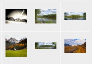
Flickr – larger images, correct ratio.

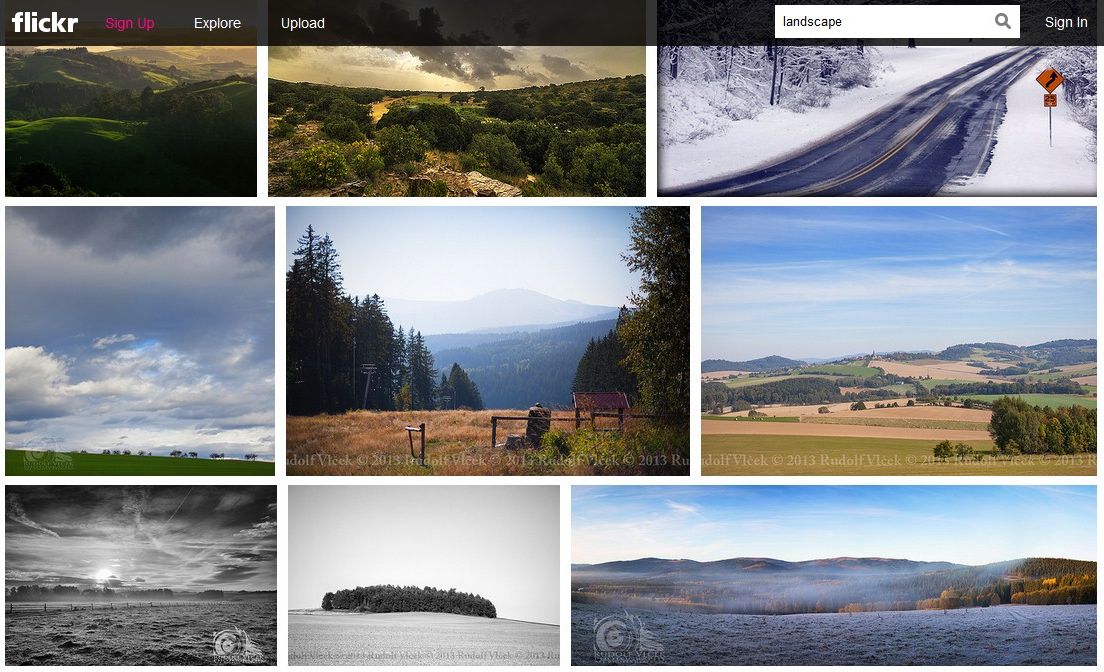
iStock – cleaner layout – square grid elements.

The image ratio is an interesting problem – if you want a neat display of x columns of images, so the width is fixed, then the height will adjust in ratio. Similarly for height.

An advantage of a consistent grid is that it makes the page layout predictable.

Panoramic images suffer particularly badly in a standardised grid. A format often used to represent sweeping vistas and sublime scale, seems squashed and subdued in comparison to less extreme formats.

Istock - thumbnails - detail

iStockphoto thumbnails

I regularly crop my own photographs to an almost square format. I liked the way it breaks the expected format of certain subjects – landscapes in horizontal frames, portraits in vertical ones – it forces the natural format of a seascape into an uncomfortable box. But I also noticed very early on that square format images seemed to leap out of a page of thumbnails purely because they utilised a bigger percentage of the allotted grid space.

[ percentage]

This means landscape and portrait images feel slightly squashed, whereas square images fill the frame. Pre-instagram the main reason you’d see square (or almost square) images was people shooting on medium format cameras.

I’ve always liked the square format and despite always using a 35mm format DSLR frequently, almost obsessively, cropped to a square format. In part this was because this made them appear larger and have more impact on traditional image result grids

In Flickr’s old design images placed into a set would appear as square-cropped thumbnails that always seemed a slightly bizarre decision as it meant a viewer wasn’t able to see how the image actually was meant to look unless it was already square or you clicked into the larger view. If your composition placed the subject at the edge of the frame they might be missing from the thumbnail completely. However, whilst I though it was an odd interface design I had a sneaking liking for it due to the serendipitous nature of the cropping.

Flickr recently changed their approach to the search results page – like Google Images the rigid grid is ditched in favour of a more dynamic layout. The height is fixed per row of images but the width is allowed to stretch to show the true aspect ratio of the image – panoramic images now have room to impress.

Flickr - thumbnails - detail

In the past I would have referred to this screen as the ‘thumbnails’ page but the size of the images displayed now seems to large, too clear, to really be described as a thumbnail.

The purpose of a thumbnail is usually to lead you through to a larger, more detailed version of the photograph. Flickr’s image results page, made possible through ever improving hardware and connection speeds, means that the images are now clear enough to really enjoy at this level. I’d be interested to know if this has lead to a reduction in traffic through to the images’ individual URLs.

What’s also interesting to me is the complete abandonment of the idea of ‘white space’ – the idea that by separating an image from surrounding clutter you get to experience it without distraction. Here images are juxtaposed cheek-by-jowl, squirrel-by-sunset, anything-by-potentially-anything-else. I would have expected this approach to be detrimental to the images, but in fact I find myself quite able to focus in on images I like and ignore those I don’t – but looking back at iStock’s grid I find myself distracted by the empty space – it seems more overpowering that the images themselves. iStock’s displays a meanness in the space it allows its images, as those it resents them distracting from the page design. It makes me think of the tastefully positioned artwork in a modernist interior design spread – the artwork is there as a prop to set-off the architecture.

Interestingly iStock launched a new larger-thumbs version of the design this November

The new design feels aimed at tablet and smartphone users. It abandons that site structure of a fixed page size into which images are loaded, and any excess images accessed via a series of numbered ‘next’ pages – instead it presents the user with an seemingly infinite scroll – as the viewer reaches the bottom of the page new rows of images are added.

In fact, after scrolling down for the equivalent of several screens worth of images the bottom is reached and the old, familiar numbered page list makes a re-appearance. However in my experience the display gets muddled at this point, clicking through to the next page frequently re-displays images that I’d scrolled through moments before – it feels like the design has tried to compromise between the two approaches.

GettyImages layout – looking fairly aged now. Pretty classic design so it has aged well, but I’m surprised it hasn’t been refreshed for the new smartphone / tablet age.

This entry began with an image from the Flemish artist David Teniers the Younger. In the 17th Century their was a fashion for paintings of art collections. Frans Francken the Younger produced works known as Preziosenwand (wall of treasures) [1]

These paintings were about the owner displaying their wealth – they are about quantity, cramming as much material possession into as small a space as possible.

It’s unusual to find modern displays of artwork where the wall is so overloaded with art. The more usual image of the modern gallery is that of a minimalist white space – each artwork is viewed in isolation, each frame in turn framed by plentiful expanses of plain wall.

We can see this in Thomas Struth’s meta-artwork ‘Art Institute of Chicago II’

Thomas-Strth-Art-Institute-of-Chicgao-2-1990-300x233

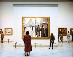
Thomas Struth “Art Institute of Chicago II” 1990
[1]

These two artworks seem to neatly mirror the different approaches of Flickr and iStockphoto.


[1]

[2]

[3] http://sherwinriveratibayan.com/project/installation-views-mainsite/

Missing Presumed Non-Existant

When you read a lot of search literature a great deal tends to be made about false positives. These are results that match your search query but not the expectations of the user.

These create noise; they distract from the useful search results and potentially push better matches further down the results page  – and we all know that users don’t tend to stray too far from the top results before giving up. [1]

But in some respects these are a lesser issue than another problem – the positive results  a search fails to bring back.

A false positive is a nuisance, but usually a user is able to identify these bad results and skip over them. They are identifiable issues.

But the failure to return a relevant item is more problematical because a user may not know if a failure to return a result is due to a failing in the search system (say poor tagging or a badly formulated search query) or the item simply doesn’t exist. The behaviour is exactly the same in both cases; the item isn’t in the search results.

The user then has a choice; adjust there search strategy to try and find a method that brings back the hoped for result – however that could turn out to be a lot of wasted effort if the results simply doesn’t exist.

Precision and Recall. Recall is a measure of the number of relevant results returned against the number of relevant results on the document set. In most cases, users will not know how many relevant results are in the document set.

However if a user has a mental picture of the size and breadth of the document set they may be able to make some assumptions about the results they have received.

For example, if I go to my small local bookshop I may not be surprised to not find an obscure academic textbook and so after a quick check in the relevant section abandon my search. However, if I fail to find a popular bestseller in a huge, flagship bookstore I am more likely to question whether I am simply looking in the wrong place.

The problem with websites is that it is frequently difficult to judge the size and breadth of the content they contain. A home page will frequently reduce the content to a manageable number of sectiosn for navigation…


Improbable Laughter: Stock Imagery as Genre

Stock photography isn’t art art.

Stock is commercial art – it’s utilitarian – it’s created to be used not simply admired.

It’s an answer to a question the photographer is hoping will be asked.

Art can exist purely on its own terms. The best art may be involved in a dialogue with the real world, with the audience, with expectations, with photography itself – but it stands on its own two feet. It may gain weight from context, the heavy black frame on the whitewashed wall of a gallery or the tastefully designed page of a book, but it can still succeed without either.

But stock is only really successful when its been used.

It’s a popularity contest – and just as with people there are different strategies to success, a successful image might aim to please as many people as possible but in doing so sacrifice certain styles or subjects that might limit its appeal, or it may target a smaller group of users knowing there will be less competition.

However, if at the end of the day its left on the shelf, it has failed as stock. It could maybe try its hand on the gallery wall instead – but the paying public have

It has its cliches. As several blogs have pointed out, it seems populated with abnormally attractive, well groomed individuals becoming improbably ecstatic at the most trivial of daily tasks, say eating a bowl of generic breakfast cereal or shaving. It’s as if their laughter is the first sign of mania brought on by the pressure of living their perfectly lit, photoshopped existence. Its my suspicion that in most cases the next frames on the memory card show the laughter getting ever more hysterical before the final shot has the model face down in the cereal bowl, sobbing uncontrollably into the corn style flakes.

Stocks very stockiness has been used by designers in a knowing way. Peter Saville used stock imagery for the New Order’s ‘Republic’ album and related singles. Blur did the same for ‘Parklife’ and ‘The Great Escape’ – in the Eighties Duran Duran’s video for Rio, with the band and accompanying models on a yacht crossing tropical sea, came to symbolise glamour and aspiration for that decade, Blur’s ‘The Great Escape’ cover with its speedboat dripped with sarcasm (the back cover [1], with the band in mock businessman mode was a nice touch too – both a play on stock’s business imagery cliches and, perhaps, a nod to Heaven 17’s ‘Penthouse & Pavement’ (it always made me think of Kraftwerk’s pre-redesign ‘Trans-Europe Express’ too. [1] The future likes to arrive wearing suits [1] [2] [3] )