
David Teniers the Younger “The Gallery of Archduke Leopold in Brussels” 1639 [1]
How best do you display a grid of image thumbnails? Two sites I use frequently have redesigned their image search results pages. They both take a different approach to the problem of how to display image results:
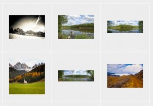
Flickr – larger images, correct ratio.
iStock – cleaner layout – square grid elements.
The image ratio is an interesting problem – if you want a neat display of x columns of images, so the width is fixed, then the height will adjust in ratio. Similarly for height.
An advantage of a consistent grid is that it makes the page layout predictable.
Panoramic images suffer particularly badly in a standardised grid. A format often used to represent sweeping vistas and sublime scale, seems squashed and subdued in comparison to less extreme formats.
iStockphoto thumbnails
I regularly crop my own photographs to an almost square format. I liked the way it breaks the expected format of certain subjects – landscapes in horizontal frames, portraits in vertical ones – it forces the natural format of a seascape into an uncomfortable box. But I also noticed very early on that square format images seemed to leap out of a page of thumbnails purely because they utilised a bigger percentage of the allotted grid space.
[ percentage]
This means landscape and portrait images feel slightly squashed, whereas square images fill the frame. Pre-instagram the main reason you’d see square (or almost square) images was people shooting on medium format cameras.
I’ve always liked the square format and despite always using a 35mm format DSLR frequently, almost obsessively, cropped to a square format. In part this was because this made them appear larger and have more impact on traditional image result grids
In Flickr’s old design images placed into a set would appear as square-cropped thumbnails that always seemed a slightly bizarre decision as it meant a viewer wasn’t able to see how the image actually was meant to look unless it was already square or you clicked into the larger view. If your composition placed the subject at the edge of the frame they might be missing from the thumbnail completely. However, whilst I though it was an odd interface design I had a sneaking liking for it due to the serendipitous nature of the cropping.
Flickr recently changed their approach to the search results page – like Google Images the rigid grid is ditched in favour of a more dynamic layout. The height is fixed per row of images but the width is allowed to stretch to show the true aspect ratio of the image – panoramic images now have room to impress.
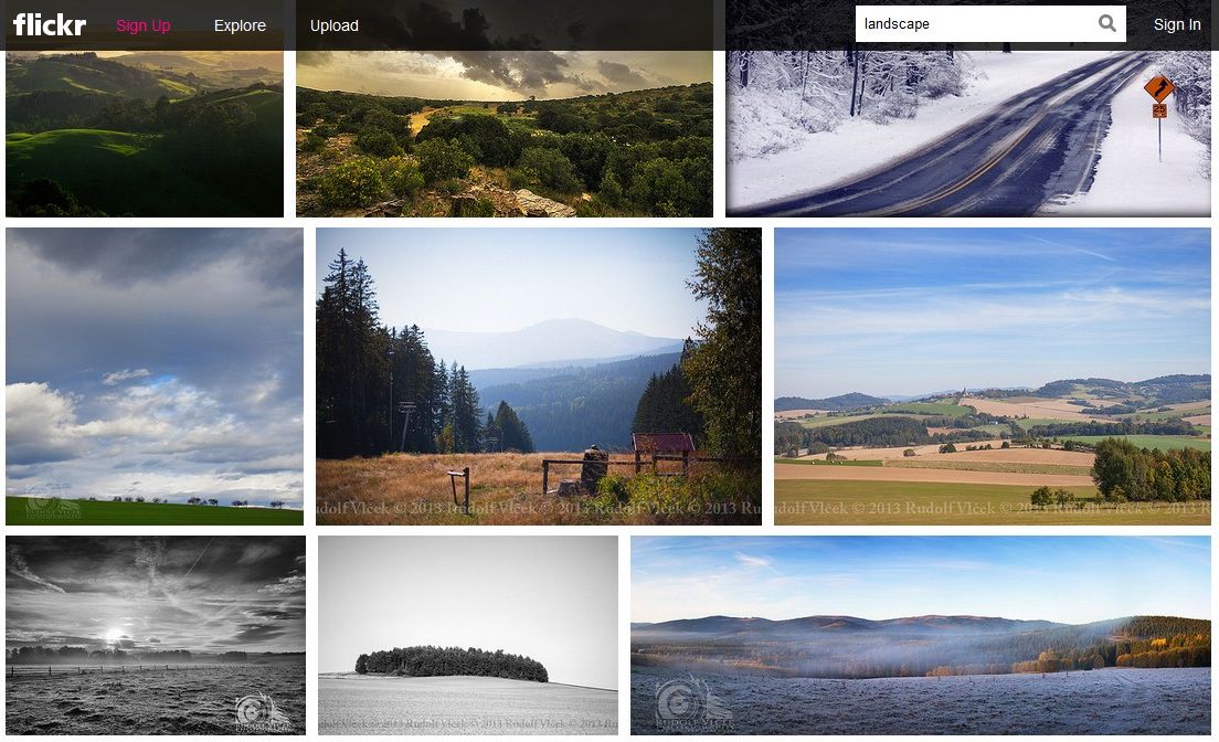
In the past I would have referred to this screen as the ‘thumbnails’ page but the size of the images displayed now seems to large, too clear, to really be described as a thumbnail.
The purpose of a thumbnail is usually to lead you through to a larger, more detailed version of the photograph. Flickr’s image results page, made possible through ever improving hardware and connection speeds, means that the images are now clear enough to really enjoy at this level. I’d be interested to know if this has lead to a reduction in traffic through to the images’ individual URLs.
What’s also interesting to me is the complete abandonment of the idea of ‘white space’ – the idea that by separating an image from surrounding clutter you get to experience it without distraction. Here images are juxtaposed cheek-by-jowl, squirrel-by-sunset, anything-by-potentially-anything-else. I would have expected this approach to be detrimental to the images, but in fact I find myself quite able to focus in on images I like and ignore those I don’t – but looking back at iStock’s grid I find myself distracted by the empty space – it seems more overpowering that the images themselves. iStock’s displays a meanness in the space it allows its images, as those it resents them distracting from the page design. It makes me think of the tastefully positioned artwork in a modernist interior design spread – the artwork is there as a prop to set-off the architecture.
Interestingly iStock launched a new larger-thumbs version of the design this November
The new design feels aimed at tablet and smartphone users. It abandons that site structure of a fixed page size into which images are loaded, and any excess images accessed via a series of numbered ‘next’ pages – instead it presents the user with an seemingly infinite scroll – as the viewer reaches the bottom of the page new rows of images are added.
In fact, after scrolling down for the equivalent of several screens worth of images the bottom is reached and the old, familiar numbered page list makes a re-appearance. However in my experience the display gets muddled at this point, clicking through to the next page frequently re-displays images that I’d scrolled through moments before – it feels like the design has tried to compromise between the two approaches.
GettyImages layout – looking fairly aged now. Pretty classic design so it has aged well, but I’m surprised it hasn’t been refreshed for the new smartphone / tablet age.
This entry began with an image from the Flemish artist David Teniers the Younger. In the 17th Century their was a fashion for paintings of art collections. Frans Francken the Younger produced works known as Preziosenwand (wall of treasures) [1]
These paintings were about the owner displaying their wealth – they are about quantity, cramming as much material possession into as small a space as possible.
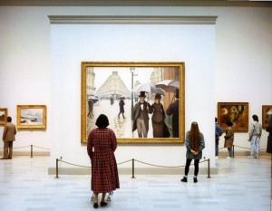
It’s unusual to find modern displays of artwork where the wall is so overloaded with art. The more usual image of the modern gallery is that of a minimalist white space – each artwork is viewed in isolation, each frame in turn framed by plentiful expanses of plain wall.
We can see this in Thomas Struth’s meta-artwork ‘Art Institute of Chicago II’
These two artworks seem to neatly mirror the different approaches of Flickr and iStockphoto.
[1]
[2]
[3] http://sherwinriveratibayan.com/project/installation-views-mainsite/